
Experience Capture Visualizations
Here are some trial pictures I've made, in chronological order. Data comes from Outlook (into which I've imported my Pilot data), as well as Emacs visits and saves, from June - August 1988.
I started looking at Email first.

This is from an earlier dataset than all the rest.
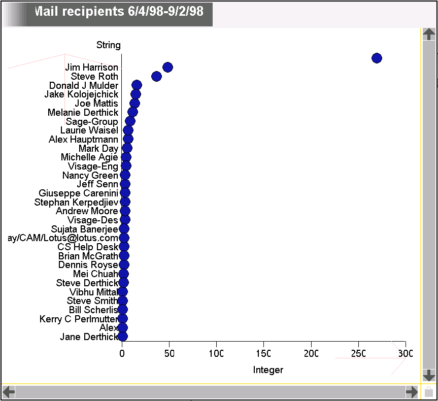
Here I just wanted to see how much mail I sent to whom. The unlabeled point is me, due to a bug. Then I wondered how sending and receiving patterns differed.
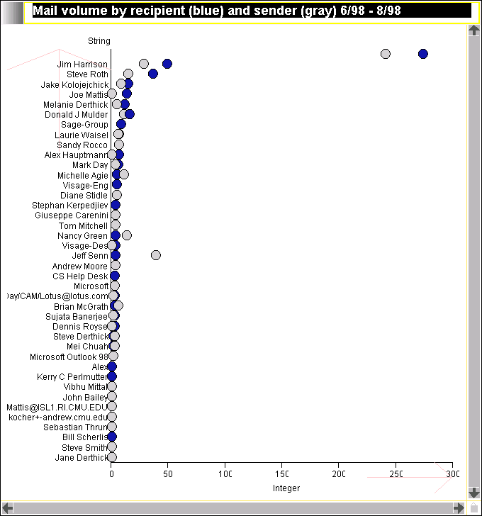
As expected there's a correlation between the amount of mail exchanged in each direction, with some outliers, notably Jeff Senn. Presumably the high incoming traffic from him is due to mailing lists. My mail to those mailing lists isn't counted in his blue dot, so the picture is a little misleading. If I had in the database who is on each mailing list I could try to avoid this lie.
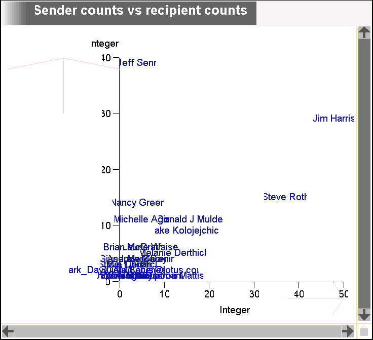
Now its easier to see outliers from the diagonal, although occlusion is a problem. I removed the Mark Derthick point because it scaled everything else into the corner. I probably want to plot log(count) instead of count. It would be nice if I could constrain the axes so x=y lay along a 45 degree angle. It would also be nice if I could edit the axis label text.
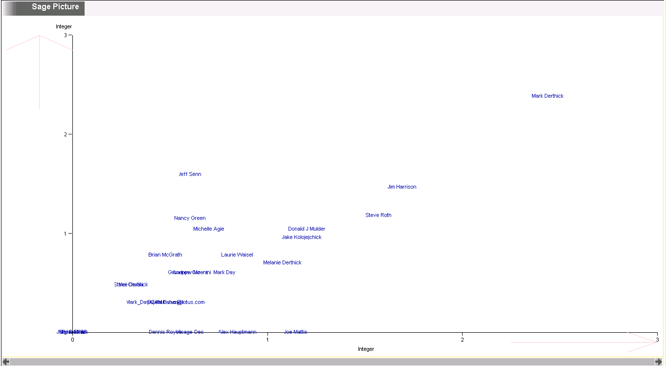
So here it is with log(counts). Now I don't have to remove Mark Derthick. Would be better if the axis did the log scaling instead of doing a variable transformation, so the axis labels would use the original numbers.
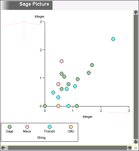
Here are the same points, but just encoding the person's category, rather than name. You no longer get the sense for where occlusion is happening. Too bad we don't have jittering. Most people I exchange mail with are in the Sage group, followed by friends. Friends tend to be closer to the recipient axis, while sage and (especially) Maya people are closer to the sender axis.
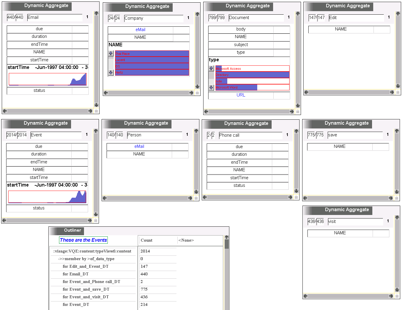
To refresh my memory, I put all the likely looking data types in VQE (on separate weblets), and put histogram sliders on interesting sounding attributes. I wasn't sure what event was, so broke it down in the outliner. Most of them show up elsewhere, but 214 are solely events. Are these the calendar entries? Bug: why doesn't the ->>member concept show count = 6? There are only 2 phone calls, because my autodialer was a late addition. The most common documents are email ones (scrolled off the screen - would be nice if the interface let you change the number of histogram bars visible at once) followed by Emacs, then Word. This might be bad data, as Windows seems to want to treat everything as a Word document. Why am I not seeing start/endTime on edits, saves, and visits? The early email outliers are messages from Microsoft that magically get received when you use Outlook for the first time. For all the analysis I did, I threw these out. Its interesting that I saved files more often than I visited them. This is probably Visage script files, where I edit the same files continuously for days, saving after each change so I can reload the file into Visage. Edit is for documents that I visit using Microsoft editors. I should make these become visits. I don't think Outlook explicitly records saves.
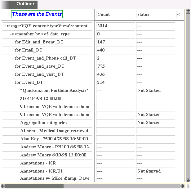
Apparently the 214 Events include both Calendar entries and Tasks. How come the only status is "Not Started"? I know I completed some tasks.
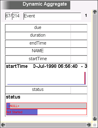
Sure enough, the only status is Not Started. And what's going on with the distribution of startTime? 67 events have no start time, including all the Not Starteds, which makes sense since the Tasks come from Pilot ToDos, which don't have times. But the startTimes for the Calendar events are way too uniform and low.
Further investigation shows this is right - my calendar events are real uniform, and overwhelmed by the spike at NULL. So lets look back at Outlook and see if there are more statuses there. All my completed Tasks are gone! Sheesh.
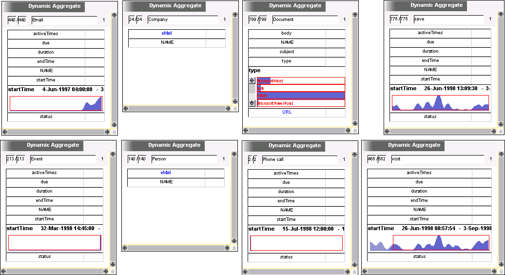
Here's a revised schema. Lining up the startTime histograms for visits and saves was a bit of a bother. Had to throw out a single visit from 1997 to get the scales approximately the same. There's a high correlation of visits and saves, except that there's one unmatched peak in visits. Let's see what's different about these files compared to the others.
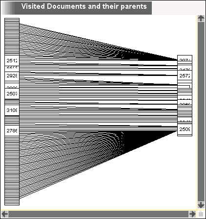
First, just see where the documents are. This was supposed to be a directory tree of them, but it looks bi-partite. Probably a data bug, but its hard to tell what's going on in this picture, and there's no way to stretch the nodes apart without scaling them bigger. The Moire patterns are kind of cool though. Why are the labels integers instead of URLs? This is the UUID. Weird.
OK - the bipartite is because it's not propagating dropping to parents. Duh. I can't think of a way to get exactly this data in the picture. If I drag out & back in the parents, I'll get their other children, too.
Well, this didn't work out very well. You can't select nodes in networks. Dragging out one parent and dropping it back in gives this:
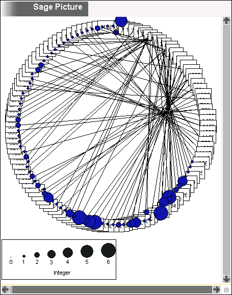
(It's now showing the visit count for each file.) I think this layotu is supposed to mean than it has cycles, which is weird. How can I figure out where there's a cycle? I guess define a unary weblet with a parent* relation. Bet that will turn up bugs. Also, if I laboriously remove and add all the parents from the previous figure, I get a renderer error. And the network pictures aren't coordinating with VQE very well.

According to this query, there aren't any cycles. Maybe its because there are multiple roots. Try to make a picture for just one root:
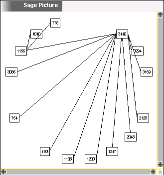
OK, its laying out a tree in a circle, which seems brain damaged. Have to ask Joe how it decides.
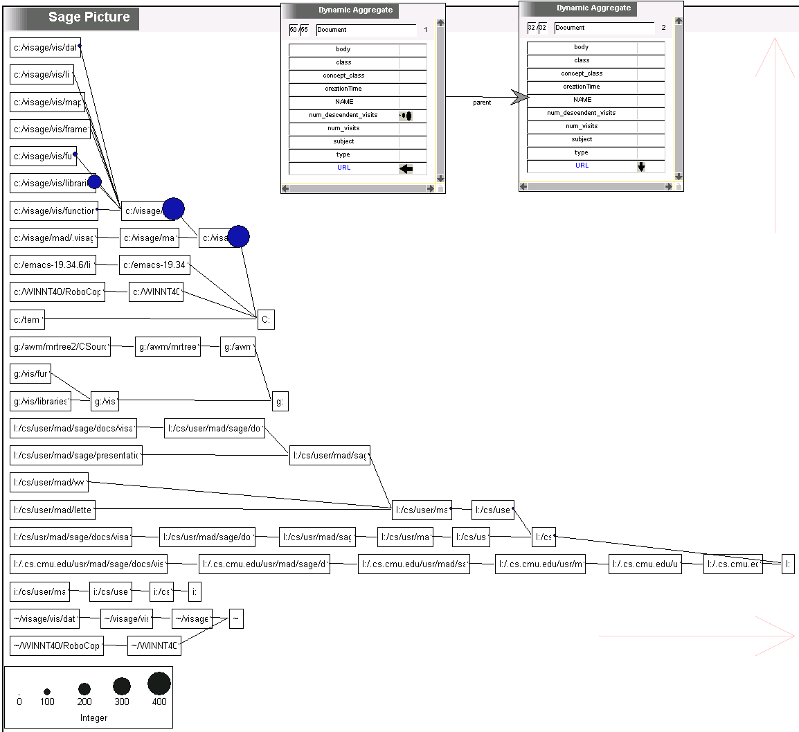
OK - removing and adding nodes from a network picture has never been fully supported. I changed a few things, added dimSeg resize arrows, and now things work enough for this visualization at least. It's hard to get the nodes you want, though. If you drop a concept in a network, thread conversion gets you the children and parents. If you want grandchildren, you have to remove the children and add them again, which is hard because you can't mark network nodes, only links. And showing all the individual files was too much info. So I used VQE, starting with visits -> documents -> ancestors -> parents. Then removed the first two dynamic aggregates (as shown), leaving a parent weblet where only directories are included. I always map AFS to the L drive. Most all the visits are to visage libraries scripts, with a few funs and functions thrown in. So this was a heavy hacking period. Its not smart about differences between \ and /, or cs and cs.cmu.edu.
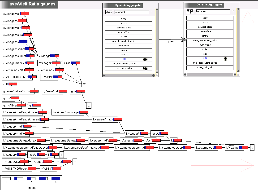
Here I wanted to see where I was editing vs where I was just visiting. First I tried to encode the ratio as saturation on the marks in the previous graph, but saturation isn't rendered correctly. So then I tried to add a gauge, but that couldn't be designed. Neither could a second mark. So you have to compare the two pictures. The directories I visited a lot are the ones I edited a lot. This would be better if it was saves/(saves + visits) instead of saves/visits if I'm going to use gauges. I didn't like marks for this because I wanted low ratios to be just as prominent as high ratios (thus I did brain surgery to make the background red). Seems like a renderer bug, or else a conceptual problem, that the top nodes don't get gauges.
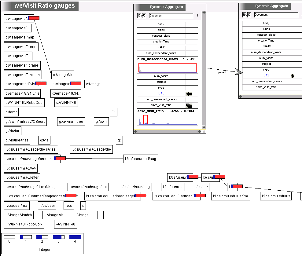
Seems to be a conceptual bug. Using DQ it's apparent that the gauges are showing attributes on one node of a weblet (the child node), rather than on a unary weblet, which is what I wanted and what the SageBrush interface seems to imply will happen. The nodes are really second class citizens in networks, being treated as encoder labels that don't have an explicit weblet. :(
At first sight, the multi-modal ratio distribution shocks. EG there are 10 directories in the small range shown. However its mostly because many directories have only only relevant subdirectory, so multiple documents are really equivalent. In this case it is still largely unexplained, as four independent subdirectories fall into this range. The next bunch over fall at 1, which is a value where you'd expect a cluster. They are all in my home AFS directory.
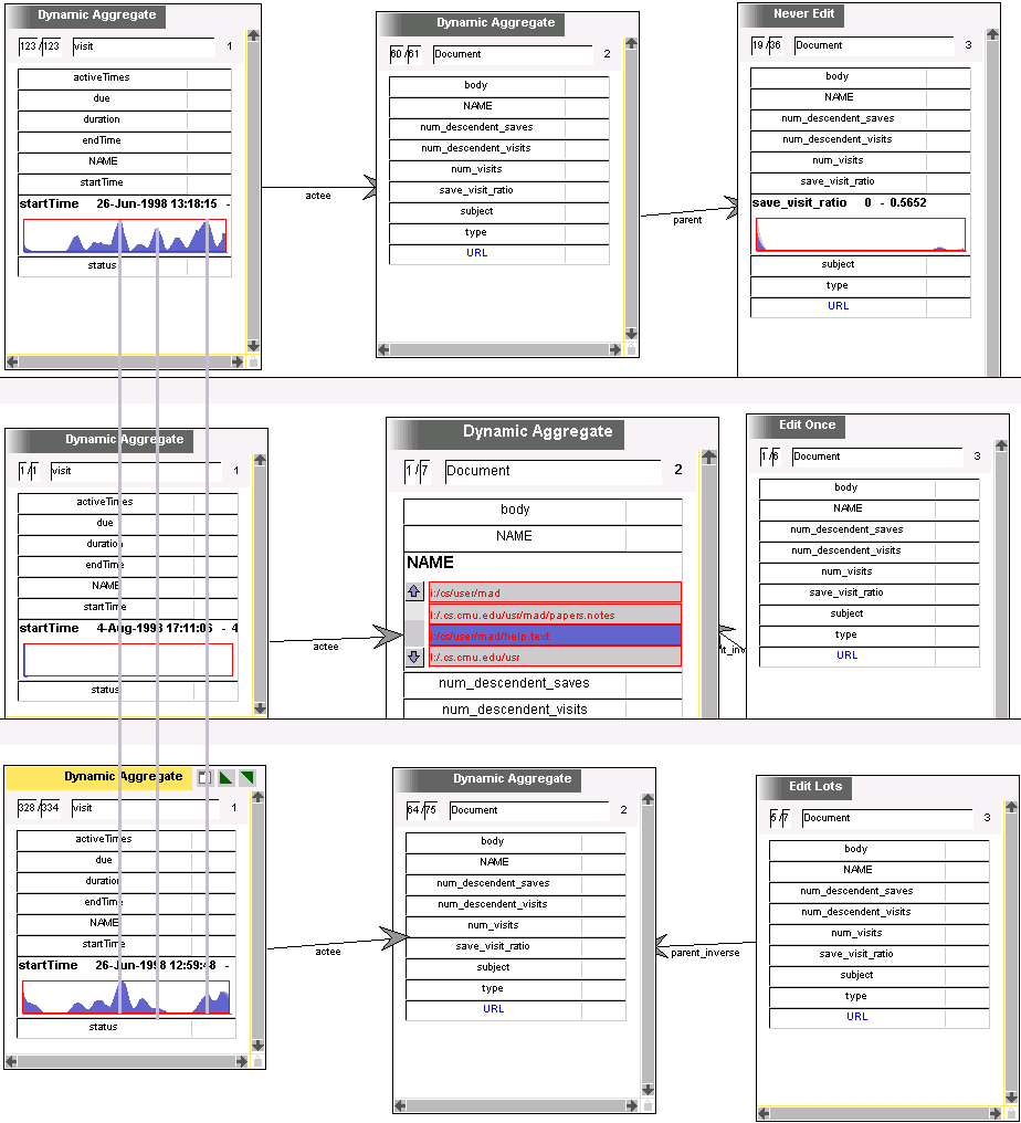
Now lets see how these clusters relate to the visit and save frequency over time. We saw earlier that these were in synch except for one peak. Here I've constructed the same weblet three times, showing the 'Never Edit', 'Edit Once', and 'Edit Lots' clusters found above. (Couldn't just copy the whole VQE, because it would have copied the aggregate concepts. That will be fixed whenever I implement the appliance builder, which will need special query-copying code.) Turns out the seemingly reasonable cluster at num-viists = num-saves is bogus -- there's only one visit/save that gives rise to the whole 'cluster'. So the information reduction I did by only looking at directories lead to some misunderstanding. If I could have had counts and ratios on the same picture, and the counts were more legible, this could have been avoided.
Anyway, visits for the remaining two clusters are highly correlated, with the notable exception of two peaks (the one where the middle gray line is, and the one to the right of that. Let's look at the files being edited in the 'Never Edit' cluster for both the shared and unshared peaks. Maybe in the shared ones its documentation files, while in the unshared its notes. Also should reduce the smoothing to verify that there are numerous periods of no editing, which would be surprising.