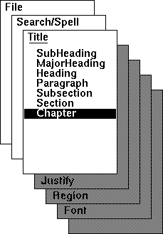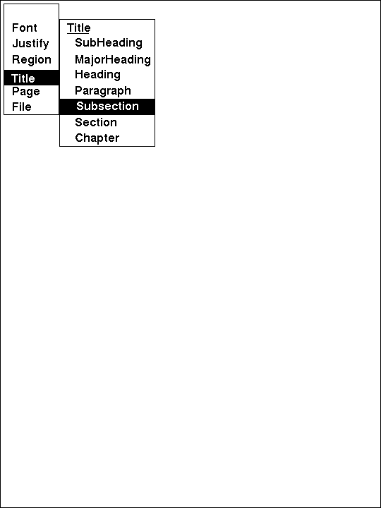
Figure 1. "Walking" menus. When the mouse enters a menu entry that has a subordinate menu, that menu is popped up to the right of the entry. In some designs, the menu only pops up when the mouse enters an icon at the right side of the entry.
KEYWORDS:
Menus, widgets, interaction, options, pop-up, pull-down.
In developing the Andrew User Interface System [1], we strove to reserve screen space for the user. We were also concerned that top-of-the-window pull-down menus could be a long mouse move away from a working point on a large screen. Consequently, we designed the system with pop-up menus. In this note, I will describe our Northwest leaning stack-of-cards menus and some of their attributes and history.
One of the earliest was "walking" menus. As implemented in early Andrew
development, these looked like Figure 1; as the mouse moved down through
a menu item, a subordinate menu might pop up to the right of the menu.
By moving straight across the menu item, the user could select from
the subordinate menu, or even from its subordinates. This scheme requires
awkward right angle turns between moving down to an item and moving
across the item to its subordinate menu. There were additional problems
with menu placement when the mouse began close to the left or bottom
of the screen.

As we discovered the problems with walking menus, Sun Microsystems
was shipping deck-of-cards menus which leaned to the Northeast, as
in figure 2. As the mouse moved upward through the corner of a card,
that card would pop to the front and its options could be selected
by moving down through the card. Many more options could now be available
with relatively short mouse movements. However, users had to make
a sharp angular turn between moving upward and scanning down through
a card.
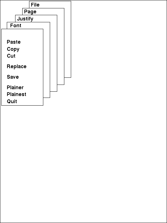
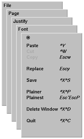
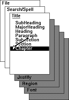
Figure 4. In the middle of the stack. The user has moved
the mouse the short distance shown by the vector and selected one of
the fifty available menu options. Cards that have been "popped through"
are shown edged in grey in this image from a monochrome display.
Problem: If you move too fast and overshoot; a lower card has popped to the front and obscures your target card. When the mouse was allowed to roam at will over the top card, it was difficult to unpop a card. Solution: Allow themouse to roamover only the left edge of the visible card. When the mouse moves further right, the most recently popped card is unpopped and becomes visible again.
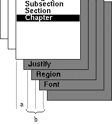
Problem: narrow margins. It is difficult to move the mouse up and
down staying in a narrow margin, but a wide margin would mean more
movement to the left for each card. Moreover, there can be a single
line of pixels where menu cards pop up and down as the mouse wavers
fromone side to the other. Solution: Make the margins fifty percent
wider when moving to the right, see Figure 5. As the mouse moves rightward,
the obscured card does not pop-down until the middle of its left margin.
As part of the development of the Northwest menus, I spent considerable time ensuring that they displayed as fast as possible. Careful computations arranges to paint only those pixels that needed to change and to paint each pixel just once. This care meant that the northwest menus popped up just a little bit faster than others and thus had just a tiny bit more responsiveness. Whether for this reason or for their ease of use, Northwest menus were adopted for Andrew and have been in use ever since.
Figure 3 shows in the upper left of the top card a round dot called the "mouse hole" or "worm hole." Moving the mouse into this space warps the mouse so the most recently selected item is reselected. This aids in repeating an operation. Unfortunately, this facility has not been implemented for the pull-down menus.
Sandra Bond insisted that the menu system should provide "automaticity," that is, a given menu option should always be at the same palce on the same card. Emulating the approach of other menu systems, we implemented greying out of menu items not currently available.
Fipp's Law is useless because the space between items dictates both target size and distance to move.
Rob Ryan added the display of key stroke equivalents to the menus.
The little line under the title line of all-but-the-top card is placed at exactly the same position is the edge of the covering card would be.
Menus with bottom card exposed. 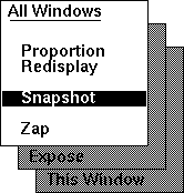
Menus with a middle card exposed. 