A novel visualization method can be used to visualize the output of any subgroup discovery algorithm, provided that the output has the form of rules with a target class in their consequent. It can also be used as a method for visualizing standard classification rules.
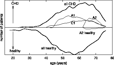
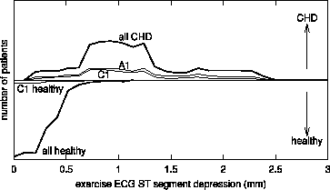
Subgroup visualization, as described in this section, allows us to compare distributions of different subgroups. The approach assumes the existence of at least one numeric (or ordered discrete) attribute of expert's interest for subgroup analysis. The selected attribute is plotted on the X-axis of the diagram. The Y-axis represents a class, or more precisely, the number of instances of a given class. Both directions of the Y-axis (Y+ and Y-) are used to indicate the number of instances. In Figure 6, for instance, the X-axis represents age, the Y+-axis denotes class coronary heart disease (CHD) and Y- denotes class `healthy' (non-CHD). Out of four graphs at the Y+ side, three represent induced subgroups (A1, A2 and C1) of CHD patients, and the fourth shows the age distribution of the entire population of CHD (all CHD) patients. The graphs at the Y- side show the distribution of non-CHD (all healthy) patients in the training set and the distribution of healthy subjects included into the subgroup A2 (dashed line).
 |
 |
 |
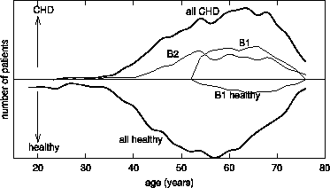
On purpose, the graphs of subgroups A1 and C1 in Figure 6 show only the coverage of positive cases (CHD patients), and in Figure 7 the graph of subgroup B2 shows only the coverage of positive cases, whereas the graphs of A2 in Figure 6 and B1 in Figure 7 indicate that the descriptions of subgroups cover positive cases (CHD patients) as well as some negative cases (healthy individuals). Except for the correct visualization of subgroups A2 and B1 and of the entire CHD and non-CHD distribution, Figures 6 and 7 have been simplified in order to enable a better understanding of the visualization method, by showing just the coverage of positive cases.
In medical domains we typically use the Y+ side to represent the
number of positive cases (CHD patients, in this paper) in order to
reveal properties of induced patterns for subgroups of these patients.
On the other hand, the Y- side is reserved to reveal properties of
these same patterns (or other patterns) for the negative cases
(patients without CHD). One of the advantages of using Y+ and
Y- as proposed above is that in binary classification problems the
comparison of the area under the graph of a subgroup and the graph of
the entire population visualizes the fractions of
![]() at the Y+ side (sensitivity TPr), and
at the Y+ side (sensitivity TPr), and
![]() at the Y- side (false alarm rate
FPr), where Pos and Neg stand for the numbers of positive and
negative cases in the entire population, respectively. For instance,
in the visualization of subgroup B1 in Figure 7 the
area under the dashed line on the Y- side represents the numbers of
misclassified training instances of subgroup B1. In this way, the
sensitivity and false alarm rate can be estimated for pattern B1 from
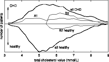
Figure 7. The same information for pattern B2 can be
found in Figure 8, showing subgroups A1 and B2 in terms
of attribute `total cholesterol value'.
at the Y- side (false alarm rate
FPr), where Pos and Neg stand for the numbers of positive and
negative cases in the entire population, respectively. For instance,
in the visualization of subgroup B1 in Figure 7 the
area under the dashed line on the Y- side represents the numbers of
misclassified training instances of subgroup B1. In this way, the
sensitivity and false alarm rate can be estimated for pattern B1 from
Figure 7. The same information for pattern B2 can be
found in Figure 8, showing subgroups A1 and B2 in terms
of attribute `total cholesterol value'.
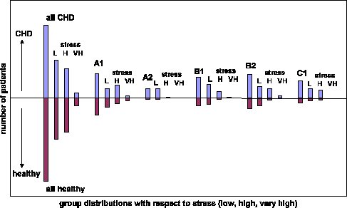
The proposed visualization method can be adapted to visualize subgroups also in terms of value distributions of discrete/nominal attributes. An approach to such visualization is presented in Figure 9. However, due to bar chart representation, it is more difficult to compare several subgroups in one visualization.
 |
 |
In general, it is not necessary that Y+ and Y- denote two opposite classes. If appropriate, they may denote any two classes, or even any two different attribute values, which the expert would like to compare.