
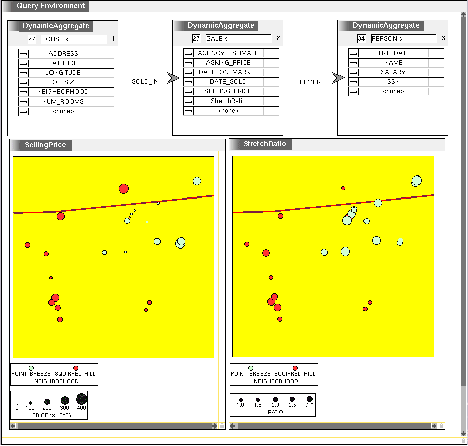
Query expressing a join between houses, sales and buyers, and two visualizations of the result, which is being filtered to show only data points where the DaysOnMarket attribute is small. See An Interactive Visualization Environment for Data Exploration for more information.
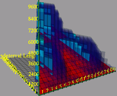
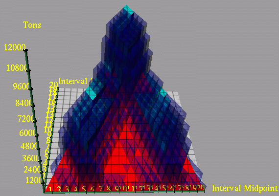
Transportation scheduling visualization showing periods of over- and under- capacity. Each grid cell represents an interval. The height of the red plane indicates the capacity in tons of the transportation system. Longer intervals are toward the back, and more tonnage can be transported in longer intervals. The height of the light blue bars is the minimum number of tons that must be transported in each interval in order to meet the schedule. The height of the dark blue bars is the maximum number of tons that might be transported in each interval, given availability of the supplies and the earliest times they can be used. The dark blue bars are partially transparent so that the light blue bars, which are necessarily shorter, can still be seen. Red areas indicate intervals of overcapacity, because more tons could be transported than the maximum number needed by the schedule. Areas where the light blue bars rise above the red capacity plane indicate intervals of undercapacity. In this schedule there are two phases, with a lot of supplies exceeding capacity being transported between days 3-7, and again between days 14-17, while there is significant over-capacity in between.
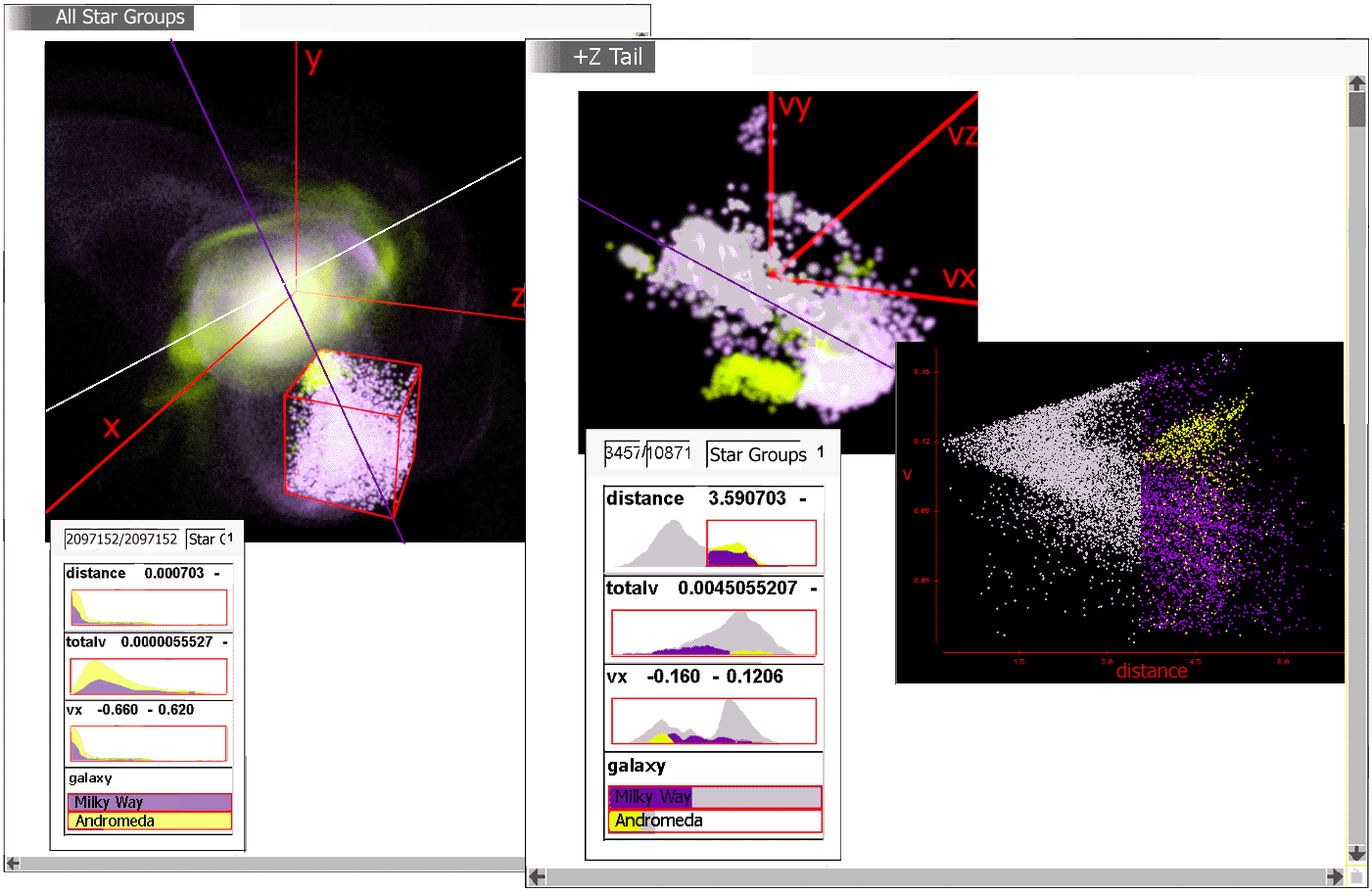
This figure is a design for exploring an astronomical dataset. The data comes from a simulation of the coming merger of our Milky Way galaxy with the Andromeda galaxy. These two galaxies are the largest members of our local galactic cluster; they will collide and merge in approximately 5 billion years. In this simulation, each point represents thousands of stars.
The dataset shown corresponds to the last frame of the animation. In the course of the collision large "tidal tails" of stars, dust, and gas have been drawn from both galaxies. These emerge toward and away from the viewer in the density plot. At the moment in question the bulk of the galactic matter has formed a roughly elliptical collision remnant, but two tidal tails remain as a structure moving around the remnant. The matter in one tail is to be selected and examined.
In the left frame labeled "All Star Groups", the astronomer has displayed 7 attributes of all the star groups in the two galaxies. The 3D visualization shows spatial position (x, y, and z). The histograms additionally show the distribution of distance from the center of the galaxy, magnitude of velocity, x component of velocity, and original galaxy each star group belonged to. On the galaxy histogram the astronomer has brushed the Milky Way star groups purple (by clicking on the Milky Way bar) and the Andromeda ones yellow.
This figure is derived from data in my Microsoft Outlook .pst file. A Visage script looks up the latitude and longitude for each contact from the address information. The top Sage picture shows the locations of all contacts in the US that I have received email from. The size of the circle shows the volume of email. The bottom Sage picture shows my social network, where the number of email messages received in common is a surrogate for social closeness. Link color indicates the folder where each common message is filed. The cluster at the bottom are employees of The Maya Group, with which I collaborate. On top are CMU colleagues. The densely connected clique are in the School of Computer Science, while the peninsula to the right are physicists. The orange cluster are family members, whom I selected with a bounding box. (This also colors the links to these people orange. Otherwise they would be colored "Personal.") Family members are also clustered in the map visualization (where they are also orange), showing the correlation of social and geographic space.
