RESEARCH
SAGE
Visage
SDM
Autobrief
VQE
Applications
SAMPLES
PAPERS
PEOPLE
HOME

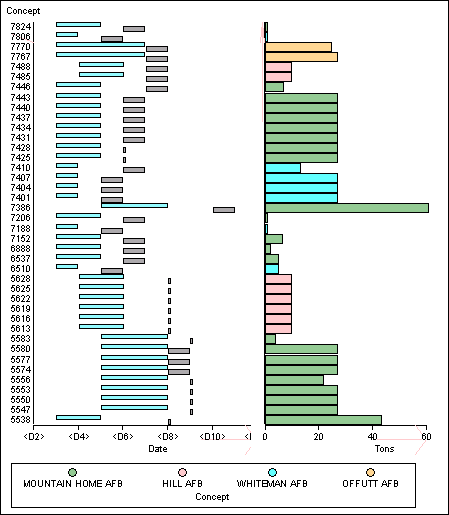
Figure 2, below, is a visualization designed with Sage to help the analyst explore problems in the schedule. Using such visualizations, the analysts diagnose the problems and make decisions about how to eliminate them. The bars of various colors in the righthand chart indicate the amount of cargo in tons coming from different ports. In the lefthand chart, the blue bars indicate the dates during which the corresponding cargo needs to be transported, while the gray bars indicate the dates when the cargo has been scheduled to be transported. Since all gray bars end after the corresponding blue bars, all of the cargo deliveries are late.

Figure 2
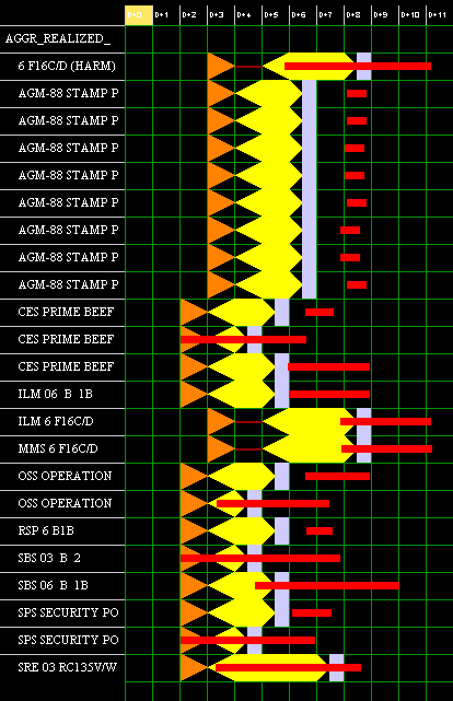
Figure 3 shows the visual editor for modifying movement requirements. This and similar tools for editing resources allow analysts to act upon the information obtained during the exploration phase by dragging and manipulating objects from previous displays. For example, (from the Sage visualization, not this web page) the analyst could drag a move requirement from Figure 2 and drop it on Figure 3. A move requirement consists of the required dates, scheduled dates, origin/destination ports, and tonnage for a particular cargo shipment, as shown in each row of Figure 2. In Figure 3, the yellow blocks show the intervals during which given cargo needs to be transported (i.e., required dates). The edges of the required date intervals can be dragged to the left or to the right, thus changing the beginning and the end of the transportation intervals. This allows the required dates for move requirements from Figure 2 to be edited in Figure 3, thus providing greater availability for scheduling shipments. Finally, the analyst can re-execute the DITOPS scheduler with the revised required dates and see the results in revisions of Figures 1 and 2.

Figure 3

