RESEARCH
SAGE
Visage
SDM
Autobrief
VQE
Solar plots
Applications
SAMPLES
PAPERS
PEOPLE
HOME

New technologies have made it much easier for us to collect and disseminate information. However, the
explosion of information also means that we have to keep track of huge amounts of information. This can
sometimes be very difficult and time consuming. The SolarPlot and Aggregate TreeMaps are visualization
interfaces that can help us better deal with certain types of large data sets. They are both based on the
concept of data aggregation or data binning. Data aggregation or binning simplifies large data sets by
summarizing groups of data elements and representing such groups with a single graphical symbol.
The SolarPlot is an interactive circular histogram. Data values are plotted around the circumference
of a circle. Interactive control is provided so that the circle may be continuously expanded or contracted.
By interactively expanding and contracting the solarPlot we can view the data at different levels of
detail (i.e. different levels of aggregation). Different aggregation levels may reveal different patterns
within the data set. From the highly aggregated display in Figure 1 we notice an increasing trend. The
less aggregated display (Figure 2), however, shows that there is also a periodic cyclic trend.
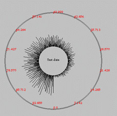
Figure 1
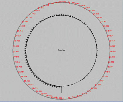
Figure 2
Like the SolarPlot, the Aggregate TreeMap also allows interactive aggregation. The Aggregate TreeMap shares many of the advantages of the SolarPlot, likes the ones described above. The Aggregate TreeMap, however, is used to view hierarchical data such as an organizational chart, or a file system. Figure 3 shows my file system hierarchy using an Aggregate TreeMap. The hierarchy is displayed such that the root (in this case my home directory) appears at the center of the circle, and pie slices radiating outwards represent sub-directories and all of their (successively nested) files and sub-directories. Saturation encodes the time at which the files were last modified, i.e. darker color indicates older files and lighter colors indicate more recent files. Hue encodes the amount of aggregation. Highly aggregated areas are more purple, while less aggregated areas are more blue.
Figure 3